Visualizing the New Rigor
Back in May, Five College Digital Humanities organized a conference called The New Rigor, in which we tackled the question of what kinds of support and evaluation structures would best facilitate making interesting, innovative digital work. The conference was a whole lot of fun, and if you’re interested in some of those conversations, I recommend checking out the conference’s website, which has documentation and notes out the wazoo. I don’t want to talk about evaluating digital projects, though—I want to talk about making silly sproingy toys in Javascript.
This is a force-directed graph (named because it simulates physical forces, e.g. sproinginess) represented all of the tweets sent out during The New Rigor, mostly between 1 PM and 1:45 PM on May 2nd, 2015. During the conference, we split participants up into color groups that more or less tracked their role in academia: red for undergraduates, orange for staff members, blue for graduate students, green for tenure-track faculty, and purple for tenured faculty. The colors of each of the nodes (those circles representing tweets) matches the tweeter’s color group. Hovering over the node displays the tweeter’s username, real name (well, their name that they go by on Twitter!) and the text of their tweet. Double-clicking any node highlights it and all nodes connected to it, and of course, you can drag the whole graph around like colorful Slinky.
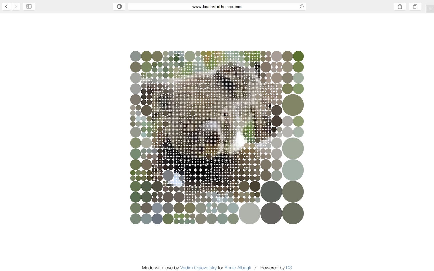
I made this visualization using D3.js, a Javascript library for making (and I paraphrase from the explanations of D3 littered across the World Wide Web) flexible data-driven documents. Charts, graphs, pixel toys that reveal koalas: if it’s made of data and visuals, D3’s got your back.

However, as fun as sproingy data is, it doesn’t really tell us anything interesting about the tweets, other than eyeballing the number of tweets in each color group. The ostensible value of tweets is as a record of the day’s proceedings. How could we get a better sense of what The New Rigor was talking about, from a macro view?
Hey, would you look at that!
This is just a slice of all of the tweets, but it encapsulates the majority of all of the tweets tagged with particular color groups, which corresponds nicely to the conference’s primary breakout session. It’s interesting to see which groups tweeted the most (staff, in orange, are the runaway victors), as well as what themes emerged at different points of the conversation. The most common talking point, as I can see it, is the value of failure, and the challenge of learning how to articulate failure as a useful scholarly practice. This is something that I thought about frequently as I put together this blog post: i.e., the value of repeated (endlessly repeated) failure when trying to get embedded D3 to work in my posts!
If you’re interested in the full visualizations, you can check them out over on The New Rigor’s website, and if you want to see the source code, you can find that on my GitHub under the newrigor-viz repo. I’m currently working on some wordclouds and tweet walls, and will write up another blog post once I get those up and running.